Your LED video wall content matters more than the wall itself. A 4K screen playing stretched stock footage will always look worse than a smaller wall running intentional, well-built visuals. Most rental conversations focus on hardware — size, resolution, brightness, pixel pitch. This post is about what almost nobody plans for: what you actually put on the screen.
If you’re sourcing a wall for an upcoming event, take a look at our LED video wall rentals — but read the rest of this first so you know what to plan for.
Why Content Matters More Than Hardware Specs
The wall is a delivery mechanism. The content is the experience.
Put the same wall in two different rooms — same size, same resolution, same brightness — and you can create two completely different events. One reads as polished and intentional; the other reads as a giant TV someone forgot to plug into something interesting. The difference isn’t the gear. It’s what’s on the screen.
Wedding content and corporate content are built on different goals — one is emotional and personal, the other is brand-driven and informational. They use the same hardware in completely different ways, which is why the next two sections break them out separately.
What to Display on an LED Wall at a Wedding
Wedding content should make the room feel like this couple’s wedding — not a generic event with a screen in it. Everything on the wall should pull guests closer to the story being told that night.
Photo and Video Storytelling
Photos and videos of the couple are the foundation. Engagement shoots, “how we met” timelines, family throwbacks, childhood photos, dating-era candids. The mistake most weddings make is dumping 200 photos on shuffle and calling it done.
Sequence them like a story — childhood, meeting, dating, engagement, the wedding day itself. Even a slow ambient loop reads as intentional when there’s an arc to it.
Video should be used sparingly. Save it for transition moments — first dance setup, parent dances, cake cutting — not as background during dinner. Constant motion behind dinner conversation pulls focus and exhausts the room.
Custom Monograms and Animated Branding
A static monogram looks like clipart. The same monogram animated — even subtly, just a slow shimmer or color shift — feels like part of the room’s design. Color-match it to the wedding palette and treat it as your “neutral” content that can play during quieter stretches.
This is your go-to during cocktail hour, dinner service, and any moment when the wall is in the background instead of the spotlight.
Cocktail Hour vs Reception Content
These two moments need completely different content.
Cocktail hour is ambient. Guests are mingling, drinking, catching up. The wall should set a mood, not demand attention. Slow photo fades, animated monograms, soft motion — anything that reads as polished without competing with the conversation.
Reception and dancing flip the energy. The content can move faster, hit harder, and sync with the music. Color washes, animated graphics, hype loops — content that earns a glance from the dance floor.
First Dance and Key Moment Visuals
First dances, parent dances, and big reveals benefit from content built specifically for the moment. Lyric videos that move with the song, color washes that match the lighting, animated effects that hit on a beat — done right, it makes the moment feel cinematic.
The rule: the content supports the moment, never competes with it. Aggressive motion behind a first dance pulls eyes off the couple. Keep it slow, atmospheric, and emotionally aligned with what’s happening on the floor.
Welcome Screens and Guest Engagement
The wall can do work as guests arrive and throughout the night.
Welcome screens with the couple’s names and wedding date set the tone the moment guests walk in. Hashtag walls and live photo uploads pull guests into the experience — but only if you’ve actually briefed them on the hashtag through signs, programs, or an MC announcement. A hashtag wall with nothing on it is worse than not having one.
Live cameras with branded overlays during reception can put guests on the wall in real time — fun for high-energy moments, but it needs to be operated by someone who knows when to cut and when to hold.
What to Display on an LED Wall at a Corporate Event
Corporate content is built around brand reinforcement, recognition, and clarity. The screen is doing work — supporting speakers, displaying sponsors, hyping the product, signaling transitions. Every frame should be intentional and on-brand.
Event Branding and Stage Backdrops
The most basic and most often-botched element is the event branding itself. Logo placement, color hierarchy, event-specific lockups — these need to be designed for the wall’s actual aspect ratio, not stretched from a 16:9 deck slide.
Backdrop content runs during welcome remarks, panel transitions, and any moment when a speaker isn’t actively presenting visuals. The rule: text needs to be legible from the back of the room. If someone in the last row can’t read it, it’s not doing its job.
Sponsor and Partner Content
Multi-sponsor events live and die on how their partners feel about the visibility. Logo rotations, sponsor reels, and tier-based hierarchies need to be planned in advance — title sponsors get longer airtime and prime real estate; supporting sponsors get rotation slots.
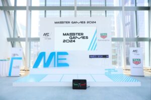
A well-built sponsor loop runs throughout networking moments, cocktail hours, and transitions. We’ve built these for everything from foundation galas to events like Master Games, where LVMH, Tiffany, and TAG Heuer all needed proper logo representation. Hierarchy decisions need to be made before content goes into production, not the day-of.
Speaker Content — IMAG, Headshots, Lower Thirds
For any event where speakers are far from part of the audience, IMAG (image magnification — live camera on the speaker projected to the wall) makes the wall essential, not optional. The back of a 500-person ballroom can’t see facial expressions without it.
Lower thirds with name and title during talks add polish and help audience members orient themselves — especially during panels with multiple speakers. Animated headshot intros that play as someone walks onto the stage build credibility before they say a word.
Product Launches and Reveals
Product reveals are where LED walls earn their cost. Pre-reveal teasers, branded countdowns, hero product imagery, animated specs — the wall builds anticipation in a way no other element on the floor can.
We’ve done this for automotive reveals where the wall ran a teaser sequence before the cover came off the car. The content sequence is the show. Get the pacing right and the room is locked in before the product is even visible.
Awards and Winner Reveals
Awards content has its own rhythm. Nominee reels build into the announcement; an animated winner reveal hits at the moment of disclosure; recipient walk-up content (name, category, branded graphics) plays as the winner heads to the stage.
Done well, the wall makes every winner feel like a moment. Done poorly, it’s a slideshow.
Hype, Transitions, and Ambient Loops
The gaps between segments are where most corporate events lose energy. Branded transition graphics, hype reels between sessions, and ambient brand loops during networking keep the room on-brand even when nothing scheduled is happening.
The ambient loops in particular are underrated. A well-designed brand loop running during a 90-minute cocktail reception keeps the event feeling cohesive without requiring anyone to actively pay attention to it.
Content Design Principles That Apply to Both
The wedding/corporate split matters for what goes on the screen. But the technical and design principles underneath are the same for both. These are the rules that separate content that lands from content that flops.
Match Content to the Wall’s Resolution and Viewing Distance
Pixel pitch is the spacing between LEDs — measured in millimeters. A 2.5mm pitch wall is high-resolution and made for close viewing. A 4mm or 6mm wall is lower-resolution and built for larger venues where guests are further back.
The mistake is treating every wall the same. Tight content with fine detail belongs on a low-pitch wall. Bold, simple visuals work better on higher-pitch walls where the audience is 30+ feet away.
And no matter the pitch — your source files need to match or exceed the wall’s resolution. A 720p image blown up across an 8-foot LED wall will look soft and pixelated. Always source assets at the wall’s native resolution or higher. If you’re still working out the wall itself before you plan the content, our LED wall size guide breaks down shape, viewing distance, and pixel pitch in one place.
Aspect Ratio and File Format
LED walls are rarely 16:9. They’re modular — built in panels — which means yours might end up at 8:1, 3:1, 5:2, or some other custom ratio depending on the install.
Build content for the wall’s actual dimensions, not for a standard slide deck stretched to fit. A 16:9 video forced onto a 5:1 wall either crops out half the content or gets warped into something that looks broken.
If you absolutely have to play 16:9 content on a wide wall, black bars are better than stretching. But it’s almost always worth the effort to design content native to the wall’s ratio.
Motion vs Static — When to Use Each
Motion grabs attention, but it exhausts the room fast. Static or slow-motion content is what most events should default to for backdrops and ambient stretches.
Save high-motion content for moments — entrances, reveals, energy peaks. If the wall is constantly moving, it stops being interesting and starts being noise.
Loop length matters too. Ambient loops should run at least 30 seconds, ideally 60+. Shorter than that and the room subconsciously clocks the pattern, which makes the content feel cheap.
Text Legibility From the Back Row
If a guest in the last row can’t read your text, it doesn’t exist.
Rules that hold up in practice:
- Headlines: six-word rule. Anything longer gets ignored.
- Body text: avoid it. If you can’t, oversize it well beyond what feels right on a laptop preview.
- Typeface: sans-serif. Serifs degrade at distance.
- Contrast: high. White on a busy background or dark gray on black will disappear.
When in doubt, walk to the back of the room during tech rehearsal and look at the wall. If you have to squint, fix it.
Coordinate Content Color With Venue Lighting
This is the one nobody plans for. If the lighting team is washing the room in blue uplighting and your content is also in a blue palette, the wall washes out and loses depth. Same issue with deep reds, purples, or any saturated single-color lighting plan.
Brief the lighting team on your content palette — or have them brief you on theirs — before the day. The wall and the lighting should be designed in tandem, not separately, so they don’t fight each other when the room fills up.
Common LED Wall Content Mistakes
These come up often enough to be worth flagging directly.
Using Low-Resolution Source Files
Pulling a logo off a website or a photo from a phone screenshot and blowing it up to fill a 12-foot wall — every pixel becomes a brick. Always source vector files for logos and full-resolution photos for imagery. If you don’t have them, ask the brand team or the photographer; don’t grab from social media.
Cramming Too Much Text
The wall is not a slide deck. Three lines of body copy that looked clean in Keynote becomes an unreadable wall of letters on a 10-foot screen. Strip it down to the headline, then strip it down again.
Stretching Content to Fit
16:9 content forced onto a wide wall almost always looks broken. Build for the actual dimensions, or accept black bars. Never accept warping.
Loops That Are Too Short
A 10-second ambient loop running for an hour means the room sees it 360 times. Even good content becomes background noise on repeat. Minimum 30 seconds for ambient; longer is better.
Skipping the Tech Rehearsal
Content always looks different on the actual wall than it does on a laptop. Colors shift, scale changes, motion reads differently. A 30-minute tech rehearsal before doors open is non-negotiable — that’s when you catch the problems you can still fix.
Content That Doesn’t Match the Run-of-Show
A generic logo loop playing while a speaker is making their key point is a wasted moment. Build a content map that tracks the schedule — what’s on the wall during arrival, dinner, the keynote, the awards, the closing. Every segment should have its own assigned visuals.
How to Plan LED Wall Content Before Your Event
Most content problems trace back to starting too late. Here’s the timeline that actually works.
4–6 Weeks Out: Inventory Existing Assets
Pull together everything you already have — brand files, photos, videos, logos, prior event reels. The goal is to know what’s usable as-is before you start creating anything new. For weddings, this means collecting engagement photos and family/throwback content. For corporate events, it’s brand guidelines, sponsor assets, and existing promo videos.
3–4 Weeks Out: Identify Gaps and Start Creating
Now you know what’s missing. Custom monograms, sponsor lockups, animated transitions, photo sequences — whatever needs to be built from scratch goes into production now. Trying to build custom content under a 2-week deadline is when things start looking thrown together.
2 Weeks Out: Build the Content Map
This is where you tie content to the run-of-show. What plays during arrival? Cocktail hour? Dinner? Key moments like the first dance or product reveal? Closing? Every segment gets a content assignment, and every transition gets a planned cue.
A content map is also what your production team works off of on the day. Without one, the day-of inevitably becomes improvisation.
Day-Of: Tech Rehearsal Before Doors Open
Walk the room. Play every piece of content on the actual wall. Check it from the back. Adjust brightness, color, audio sync if applicable. Run the cue list with whoever’s operating the wall.
Never trust a laptop preview. The wall is the wall.
A Few Examples From Our Events
A handful of recent installs that show what intentional content design looks like across different event types.
Iconic Candy: Corporate Brand Activation
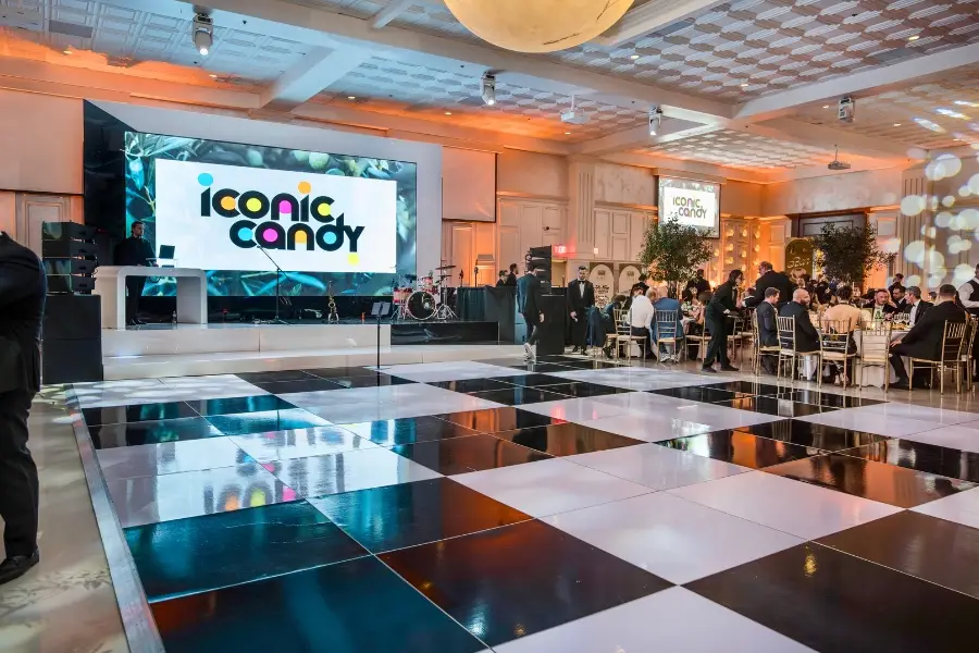
A multicolor candy-themed corporate activation where the wall ran the brand lockup throughout, paired with a high-contrast checkered dance floor. The wall didn’t compete with the room — it set the tone and let the rest of the production breathe.
Lamborghini Paramus: Automotive Reveal Sequence
The wall ran a teaser sequence (“FROM NOW ON”) before the reveal, then transitioned into Lamborghini Paramus branding once the cover came off the car. Pacing the content with the reveal is what made the room hold its breath at the right moment.
Karlos Rodón Foundation Gala: Branded Charity Event

A foundation event where the wall served as the primary stage backdrop, running the foundation’s branded content throughout the program. Sponsor logos rotated during transitions, and the wall doubled as the visual anchor for speaker moments.
Master Games 2024: Multi-Sponsor Activation

A complex corporate activation with LVMH, Tiffany & Co., and TAG Heuer all needing visibility. We built a tiered sponsor loop that ran during networking and transitions, paired with the event’s master branding during program moments — every partner got proper representation without the wall feeling like a billboard.
Planning a Wall? Plan the Content With It.
The hardware buys you the canvas. The content makes the room. A modest wall running great content will always outperform a massive wall running stretched, generic, last-minute material.
Whether it’s a wedding, corporate launch, corporate gala, or multi-day activation, content planning should start as early as the wall booking does. It’s the part everyone wishes they’d thought about sooner.
Planning your next event? Talk to us about video wall rentals and we’ll help map your content alongside the install.