LED wall size is the first thing people ask about—but “bigger” isn’t automatically “better.” The right wall is the one that looks sharp, reads clearly, and fits the room like it belongs there, not like a giant screen got shoved into the space.
The real goal is impact + legibility + clean integration. You want it to hit visually, stay readable where it matters, and work with staging/lighting/traffic flow so it doesn’t disrupt the event.
This guide helps you decide the right shape, size, resolution/pixel pitch fit, and install approach—so you don’t waste budget on the wrong build.
If you want help designing the right setup, check out our LED video wall rentals.
Start with the job the videowall needs to do
The three most common event “jobs”
A videowall doesn’t have one universal “correct size” because its size depends on what it’s doing. Pick the job first, and the right scale becomes obvious.
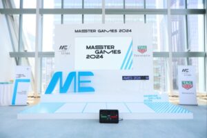
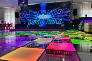
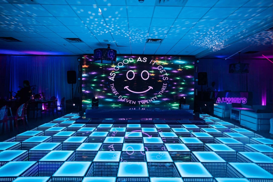
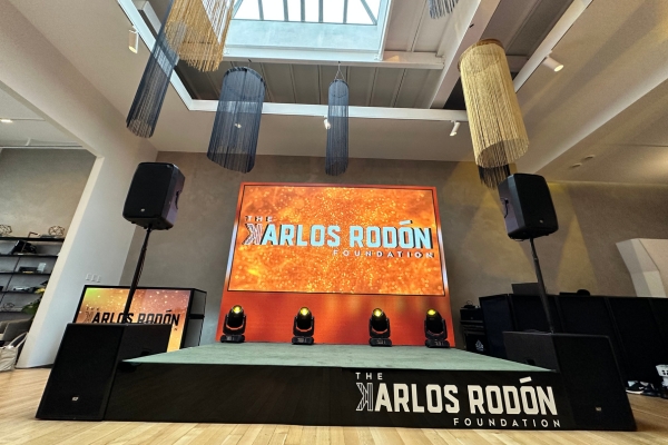
Backdrop / stage focus walls are the “hero moment” installs—DJ, band, ceremony focal, sweetheart table, keynote stage, brand reveal. Here, the wall is about presence, symmetry, and looking premium in wide shots.
Content-first walls are built for information—presentations, sponsors, agenda, readable visuals. This is where people mess up sizing most, because text and detail fall apart fast when the wall isn’t big enough for the viewing distance.
Immersive environment builds are about experience—tunnels, ceilings, spheres, right-angle wraps, curved layouts. In these setups, “how big” is less about one rectangle and more about coverage, angles, and how the crowd moves through the space.
What content will actually be shown?
Content is the real driver of sizing. Motion graphics can be flexible and still look good when scaled or cropped. Slides are not forgiving—if the layout is wrong or the wall is too small, no one can read it, and the wall becomes expensive background noise.
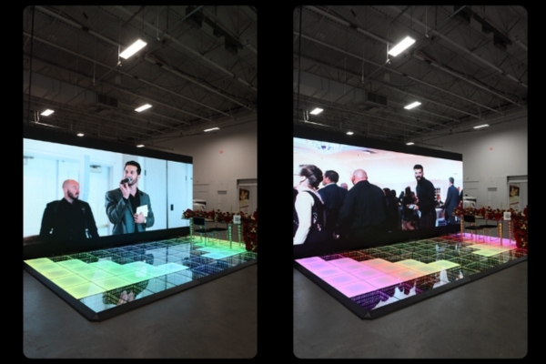
Live feed and camera IMAG need a clean, dominant window so faces look natural and the shot doesn’t feel cramped. Mixed layouts (camera + slides + sponsors) need enough canvas to avoid turning everything into tiny boxes.
That’s why content type dictates aspect ratio, usable height, and how “tall” the wall should feel in the room. A wide wall can feel massive without being super tall, while a tall wall can feel awkward if the content is mostly wide.
Choosing the shape and aspect ratio
The practical event shapes that work most often
Most expensive-looking installs fall into a few shapes that match how rooms and cameras actually see an event. You pick the shape that supports content and sightlines first—then scale it up.
Wide walls are the go-to for stages because they feel cinematic, photograph well, and make branding/motion look intentional. They’re also strong for IMAG when you want a big hero window.
Tall walls win for entrances, narrow spaces, step-and-repeat moments, and vertical content. They can be a mistake for slide-heavy events unless the deck is designed for that format.
Near-square walls are great for multi-window layouts because they give you usable space for multiple sources without forcing everything into skinny strips.
Right-angle/corner walls create a wrap effect that feels immersive without needing a full tunnel. They’re great when people are spread across the room and you want visuals from multiple angles.
Curved walls feel premium because they add depth and make the wall feel integrated into the space—especially when the content is designed for it.
Pixel density: what keeps your wall looking “crisp”
| Viewing Distance | Pixel Density |
| 5 feet (1.5m) | 57 PPI |
| 10 feet (3m) | 28 PPI |
| 15 feet (4.5m) | 19 PPI |
| 20 feet (6m) | 14 PPI |
Pixel density is what separates a wall that looks premium from one where you start noticing the grid. Brightness and contrast matter, but resolution + pixel density are what make images feel sharp and detailed—especially with text, logos, lines, and fine graphics. A videowall’s total resolution is the full pixel count across the array, but pixel density is how tightly those pixels are packed into physical space, and that’s the part your eyes punish when you’re standing close.
Viewing distance is the rule that decides pixel pitch
Spec for the closest viewer, not the back of the room. Human visual acuity has a practical limit (often explained as about one arc minute) where individual pixels become hard to resolve; below that threshold, the image looks smooth instead of “pixel-y.” As a clean benchmark, at about 10 feet (120 inches) you generally want around 28 PPI to reduce visible pixel structure. Translation: the closer people stand—or the more text-heavy your content is—the tighter the pixel pitch you’ll want so the wall stays clean on camera and in real life.
Match the wall to the room’s geometry
Room layout is the silent decision-maker. A low ceiling and wide room usually calls for a shorter, wider wall that keeps sightlines clean while still looking huge.
Narrow rooms or high ceilings can support taller builds, especially when the wall is meant to be a dramatic focal point and the audience isn’t standing right on top of it.
Where the wall “lives” matters too—behind a stage, dance floor focal point, entry moment, trade show booth, brand activation. Each placement changes viewing distance, crowd movement, and what the wall needs to communicate.
Plan your content layout before you lock the wall size
Storyboard the wall in 3–4 quick layouts
Before you pick dimensions, mock the layout. This is the easiest way to avoid the classic mistakes: cropped content, wasted space, or unreadable text.
A single hero visual layout is the cleanest, most premium option for vibe-first events—one big visual that looks expensive and stays uncluttered.
A split layout (logo + motion + lower-third messaging) is great when you need branding and messaging without shrinking the main visuals.
A multi-window layout (camera feed + slides + sponsor loop) is where you usually need more wall than you think, because every window still has to be readable.
Don’t force content into the wrong shape
Keep native aspect ratios when you can. Stretching slides, faces, or logos is the fastest way to make a high-end wall look wrong.
Cropping is fine for abstract motion backgrounds and textures. Cropping becomes a problem when it cuts off faces, important text, or logos—because people immediately notice.
Text-heavy slides typically need more usable screen height/area than people expect. If the event relies on people reading, you size the wall for legibility first and “wow” second.
The sizing factors that actually decide “how big”
Viewing distance is the #1 sizing variable
The closest viewer matters most—front row seating, dance floor edge, expo aisle traffic. If people can get close, you have to plan for that distance, not just the back of the room.
The closer people stand, the more pixel structure and legibility matter. A wall that looks great from 30 feet can look rough from 8–10 feet if it isn’t specced for close viewing.
Pixel pitch and “can people see pixels?”
Pixel pitch is basically the spacing between LEDs. Smaller pitch generally means a sharper-looking image up close; larger pitch can still look great from farther back.
That’s why pixel pitch ties directly to the room: close-view installs and text-heavy content usually need tighter pitch; big-room, video-heavy installs give you more flexibility.
Quick event rule: if guests will be close and you’re showing text, treat sharpness as a requirement. If it’s mostly motion/video and the crowd is farther back, you can prioritize size and shape for impact.
Screen real estate vs readability
If your wall shows text, charts, speaker names, or sponsor grids, you need enough wall area to keep things readable without shrinking fonts into nothing.
If your wall is mostly video and motion graphics, you can prioritize “wow scale” and composition, because video content stays legible at smaller relative sizes than text does.
Modular LED walls: how configuration affects size decisions
Why modular sizing changes the whole planning process
LED wall size gets easier when you remember LED walls are modular—meaning you’re not stuck with a “TV size,” you’re building a wall to fit the room and the moment. That’s huge, because the wall can be scaled wider, taller, or shaped differently based on where it lives: stage, entry, booth, dance floor, or a full immersive install.
The other big win is control. Modular walls let you dial in video wall dimensions so the content looks intentional instead of stretched or awkwardly cropped. And since events are photographed constantly, clean edges matter. Seam alignment and straight lines can be the difference between “premium” and “kinda janky” in wide shots and phone videos.
Configuration options that impact footprint and safety
How the wall is built changes the footprint and what’s possible safely. Ground-stacked builds are flexible and fast, and they work great when you want a strong visual anchor without relying on venue rigging points. Flown/rigged walls can look insanely clean and free up floor space, but they depend on the venue, ceiling height, and proper load planning.
Curved builds are a design choice that can make a wall feel more integrated and higher-end, but they need more planning and the right content to shine. And immersive options—ceiling treatments, tunnels, spheres—make sense when the goal is experience, not just a screen. They’re perfect for entrances, brand activations, and dance floor energy, but they require extra coordination so they enhance flow instead of blocking it.
Real-world sizing examples by event type
Weddings
Wedding walls usually fall into three moments: ceremony backdrop, reception stage wall, or a dance-floor focal. Ceremony backdrops tend to look best when they’re wide enough to frame the couple without overpowering the space. Reception stage walls should feel proportional to the DJ/band footprint, so it doesn’t look like the entertainment is “tiny” in front of the wall.
Photos matter here more than people think. The wall’s proportions show up in every wide shot—first dance, toasts, entrances—so the goal isn’t just “big,” it’s “balanced.” A wall that’s too tall can swallow the couple in photos; a wall that’s too small can look like a random TV in the background.
Corporate events and conferences

Corporate events are presentation-first most of the time, which means readability wins. If the wall is showing slides, sponsor grids, or any text-heavy content, you size it around what the back half of the room needs to see, not what looks cool up front.
If you’re running IMAG or live feed, sightlines become the sizing driver. The wall needs to be positioned and sized so the audience can see faces clearly without craning their necks, and so the wall doesn’t block the stage or compete with the speaker. This is where pixel pitch and viewing distance matter a lot—close seats and crisp text demand a sharper spec.
Trade shows and brand activations
Trade shows are all about constraints: booth width, height limits, and aisle distance. A wall that’s too tall or too deep can kill your usable footprint fast, and that matters when every square foot costs money.
The goal is “stop-the-scroll” in real life—something that pulls people in as they walk by. That usually means bold motion graphics, clear branding, and video wall dimensions that look intentional in a busy visual environment. Here, the closest viewing distance is often just a few feet, so spec and content need to hold up up close.
Common sizing mistakes that ruin the result
One of the biggest mistakes is building a wall too tall for the ceiling sightlines. It looks overwhelming, blocks views, and makes the event feel cramped. Another is going too small for text-heavy content—slides and sponsor grids become unreadable, and the wall turns into expensive decor.
Wrong aspect ratio is a sneaky killer. If the content package is built wide and you install a tall wall, you’ll end up with awkward empty space or forced cropping. Ignoring viewing distance is another classic mistake—people get close at events, and if you didn’t plan for that, pixel structure becomes noticeable fast.
And finally, not planning power, cable paths, and rigging early enough causes rushed installs and messy visuals. Even a perfect wall can look bad if cables, alignment, and placement are treated like afterthoughts.
A quick checklist to pick the right videowall shape and size
Start with room width and ceiling height, then identify the closest realistic viewing distance. Next, confirm the content types—slides, video, live feed, or mixed layouts—because that determines whether readability is the priority.
Decide if you’re running a single hero visual or a multi-window layout, since multi-window almost always requires more total screen area. Choose the install method—ground-stacked vs rigged—based on venue constraints and the look you want. Finally, lock a timeline for content coordination so the visuals match the wall’s aspect ratio and resolution and you’re not hacking it together last-minute.
Frequently Asked Questions About LED Video Wall Sizing and Dimensions
What shape is best for a videowall at events?
The best shape is the one that matches the room and the content. Wide walls are the safest for stages and cinematic impact, near-square works great for multi-window content, and tall walls shine for entrances and vertical moments.
How do I choose videowall size for presentations vs video?
If it’s presentations, size for readability first—text and charts need usable area. If it’s mostly video and motion graphics, you can prioritize scale and composition for maximum impact.
How does viewing distance affect resolution and pixel pitch?
The closer people stand, the more they can notice pixel structure—especially with text and fine lines. That’s why pixel pitch and viewing distance should be decided together, not separately.
Can I do curved walls, right angles, tunnels, or ceilings?
Yes—those are modular configuration choices. They make the most sense when the goal is immersion or a branded experience, and they require planning for footprint, safety, and audience flow.
Indoor vs outdoor sizing considerations
Outdoor installs need weather-rated panels and secure systems, and brightness and safety planning matter more. Indoors, you usually have more control—but sightlines and viewing distance still drive whether the wall looks sharp and readable.
Conclusion: Make the wall fit the room, the content, and the crowd
The clean way to spec a wall is always the same: define the job, match it to the room, plan the content layout, validate viewing distance, then choose the right configuration. That’s how you land on an LED wall that looks premium, reads clearly, and feels like part of the event—not an add-on.
Want us to spec the best build for your venue and content plan? Explore our LED video wall rentals and we’ll design the right size and configuration for your event,